
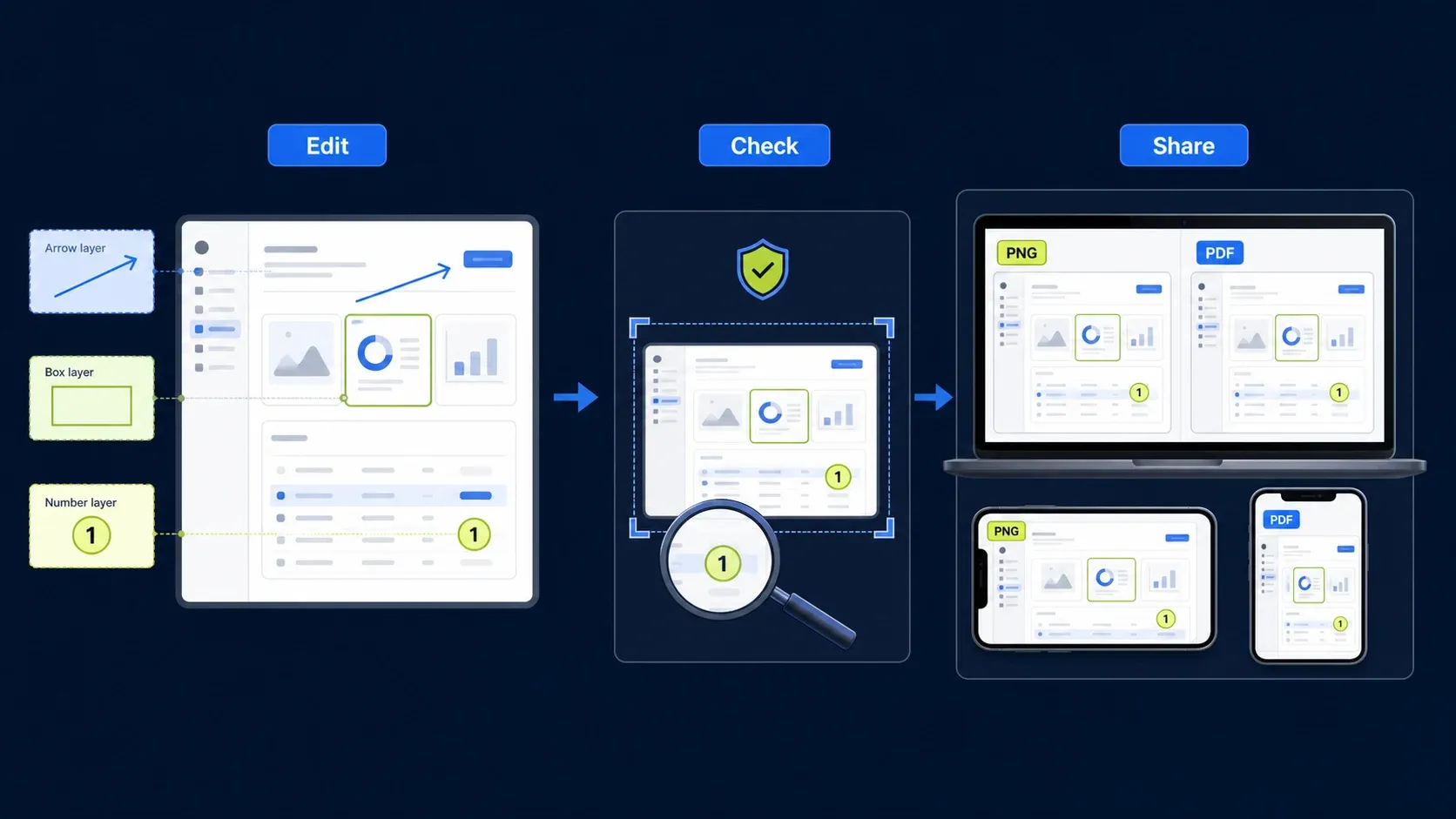
Open the capture in Snagit Editor, crop to the smallest useful area, remove private information, and choose one primary mark. Use Arrow for a precise control, Shape for a region, Callout for a short explanation, and Step for order. Review the image at the width your reader will see, keep the editable SNAGX source, and export a clean delivery copy.
How to annotate a screenshot in Snagit in six steps
This order keeps the source clean, protects private data before visual polish, and gives you a recipient file you can verify independently.
- Open the capture in Snagit Editor: Capture the screen or open an existing image, then duplicate the capture when you need an untouched source.
- Crop to the smallest useful area: Remove empty space and unrelated interface chrome while keeping the nearby labels that tell the reader where the control lives.
- Remove private information: Use safe demo data when possible. Cover sensitive values before adding instructional marks and verify the delivery copy separately.
- Choose one primary annotation: Use Arrow for one precise control, Shape for a region, Callout for a short explanation, or Step for a linear sequence.
- Review the actual delivery size: Check arrow placement, label contrast, crop context, and readability at the width used on the page, ticket, slide, or email.
- Keep the source and export the recipient copy: Save the editable Snagit work as SNAGX, then export and reopen a flattened PNG or other required delivery format before sharing it.
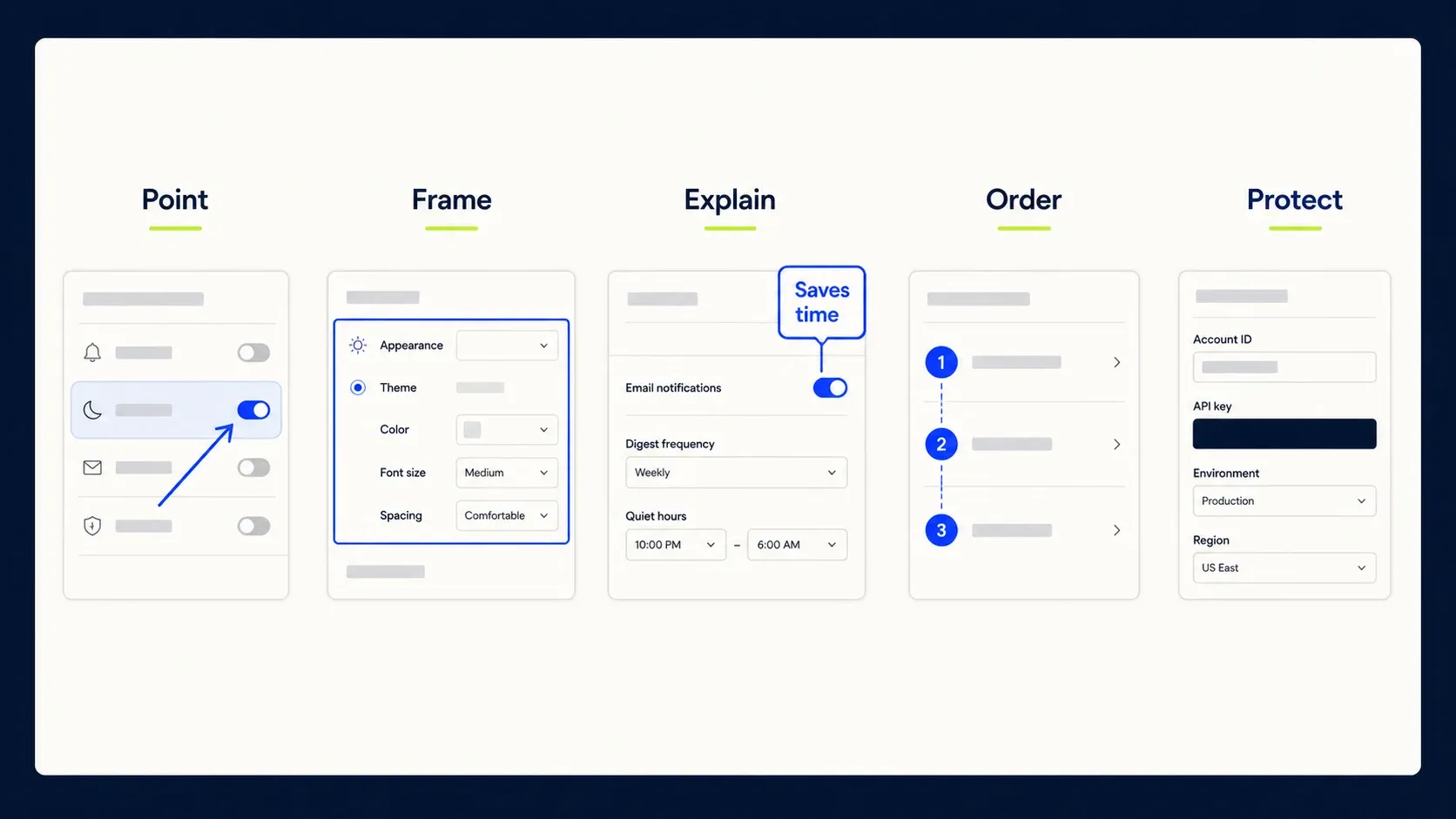
Choose the Snagit annotation that matches the job
Don’t start by browsing every available stamp and effect. Start with the question the reader is trying to answer. One visual device is usually enough; two can work when they have different jobs.
| Reader needs to know | Best annotation | Common mistake |
|---|---|---|
| Exactly where to click | Short arrow | Arrowhead lands beside the control |
| Which field or panel matters | Outline box or spotlight | Thick stroke covers the UI label |
| What happens first, second, third | Numbered Step markers | Numbers imply order where none exists |
| What a control does | Short callout | Paragraph pasted into the image |
| Which text changed | Highlight or underline | Color is the only cue |
| Why a tiny detail matters | Magnify with context | Zoom removes all orientation |
| What must not be shared | Opaque redaction | Soft blur treated as secure deletion |
Use Snagit or the built-in tool that fits the job
You don’t need a full editor for a one-off arrow or note. Take the built-in route when the screenshot is disposable; reach for Snagit when you need editable objects, repeatable styles, numbered procedures, maintained source files, or a team workflow.
| Platform | Quick path | Best use |
|---|---|---|
| Snagit on Windows or Mac | Capture → Editor → Arrow, Shape, Callout, Step, or Highlight | Documentation and repeatable visual standards |
| Windows 11 | Win+Shift+S → open the snip → Pen, Highlighter, Shapes, or Text Actions; use Paint for typed labels and broader layout | Fast local markup, OCR, shapes, and quick redaction |
| macOS | Open the image in Preview → Show Markup Toolbar | Shapes, text, sketching, and quick feedback |
| iPhone or iPad | Open the screenshot preview → Markup | Pen, text, shapes, and a quick mobile note |
| Android | Open the screenshot in Google Photos → Edit → Markup | Pen, highlight, and text; save as a copy |
These paths are current in the official instructions for Windows Snipping Tool, Preview on Mac, Apple Markup, and Google Photos Markup. Tool names can vary slightly by OS version and phone maker. Whichever editor you use, save a copy before flattening a screenshot you may need to revise.
If you’re still choosing the capture and annotation app before building a workflow, the current screenshot software comparison separates built-in, free, automated and documentation-focused options by platform and maintenance needs.
On Mac, work on a copy when you annotate a PNG or JPEG in Preview. Apple warns that image annotations cannot be edited, moved, or deleted after the image is saved. If the marks must stay editable, keep an editable Snagit source or use the file type and workflow Apple recommends for later changes.
Start with the right screen state
Annotation can’t correct the wrong source image. Reproduce the task, wait for loading to finish, dismiss unrelated menus, and capture the state the reader will actually encounter. Use demo data when possible, and close notifications and unrelated tabs before capture; they’re distractions and privacy risks at the same time.
Crop close enough that the target occupies a meaningful part of the image, but keep the navigation label, dialog title, or nearby control that tells the reader where they are. A crop that shows a button without nearby labels or controls is hard to match to the real interface. A full 4K desktop shrunk into a narrow article column is equally useless.
Long pages deserve special treatment. Use focused sections rather than shrinking a huge image until labels become unreadable. The scrolling screenshot guide explains when a full-page render helps and when separate task-level captures are clearer.
Give each screenshot one primary job
Before drawing anything, write a private one-line brief: “Show where to enable System Audio” or “Show the error state after an invalid token.” If two unrelated verbs appear in that sentence, split the image. This small constraint prevents the familiar screenshot with four arrows, three colors, two callouts, and no obvious starting point.
Every extra screenshot and annotation becomes another asset to recapture after the interface changes. Use images where they remove real ambiguity, keep the procedure understandable in text, and record the product version or verification date so a future editor can tell which assets need review.
Use Simplify when the interface itself is the clutter
Sometimes the annotation is not the problem. A dense dashboard, crowded toolbar, or screenshot full of labels can overpower even one careful arrow. Snagit’s current Image Simplifier can replace detected interface detail with plain shapes: open the capture, select Simplify, enable Auto Simplify, adjust the Detail control, then restore or edit any element the reader still needs.
Use Simplify for conceptual training, version-tolerant documentation, translated material, or a diagram where the exact text is not evidence. Do not simplify an error message, setting value, legal record, or bug reproduction whose exact pixels matter. Keep the original capture and label the simplified graphic so nobody mistakes it for the literal current interface.
Simplify is also not a security guarantee. TechSmith presents it as a way to reduce sensitive detail, but a deliberate privacy workflow still starts with safe demo data and ends with an opaque, flattened delivery copy. Treat visual simplification and secure redaction as separate decisions.
Refer to Snagit tools by name
TechSmith’s current feature reference lists arrows, callouts, shapes, Step markers, Spotlight, Magnify, Quick Styles, and themes as Snagit image tools, and the official hotkey guide documents direct shortcuts for commonly used Editor tools. Tool positions and shortcuts can differ after toolbar customization, so describe the tool by name rather than by an assumed position.
For a complete tour of object selection, properties, themes, and editable files, use the Snagit Editor guide.
Use arrows for points and boxes for regions
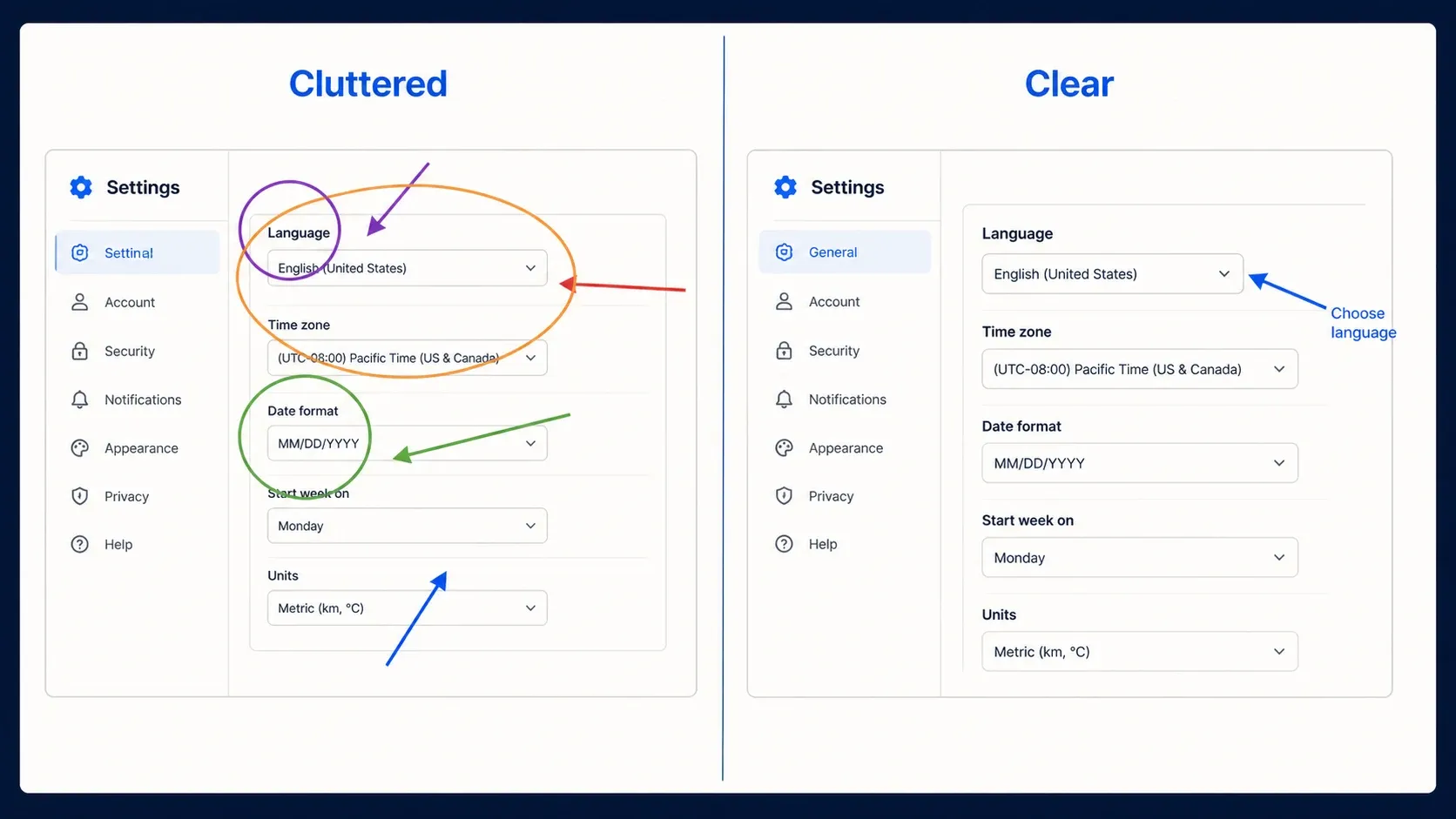
An arrow works when the target is precise, such as a small icon, toggle, menu item, or validation message. Put the arrowhead on the target, not somewhere near it. Keep the shaft short, draw from open space toward the control, and avoid crossing text or another arrow. If the arrow must travel across half the screen, the crop is probably too wide.
A rectangle or rounded outline works better for an input group, panel, selected row, or area that should be compared as a whole. Leave a small margin inside the outline so the stroke does not touch the interface text. Use a translucent fill only when the underlying content remains readable.
Spotlight or dimming can isolate one region when the background is genuinely necessary for orientation. TechSmith currently lists Spotlight as Mac-only, so cross-platform teams should not build a required Windows workflow around it; a translucent overlay or a closer crop can produce the same visual hierarchy. Spotlight is too heavy for a simple button that a closer crop could reveal. Magnify is similar: preserve a visible connection between the enlarged detail and its source so the reader can still locate it.
Write labels that support the instruction
Use the exact interface term when it is visible: “Choose PNG,” “Turn on System Audio,” or “Select Capture more.” Short imperative labels scan faster than commentary. Keep prerequisites, exceptions, and troubleshooting in HTML text, where they remain searchable, selectable, translatable, and accessible.
A callout should not duplicate the whole sentence immediately beside the image. Give it a distinct job: identify the target, state a warning, or name the expected result. If the label needs more than a short phrase, move the explanation into the surrounding paragraph and leave a simple number or arrow in the screenshot.
Build hierarchy with contrast, not decoration
Pick one high-contrast action color that stays visible over both light and dark interface areas, and add a light or dark outline when the background varies. Reserve a second color for warnings or destructive actions. Don’t assign a different color to every step; readers shouldn’t have to decode a legend before they can use the image.
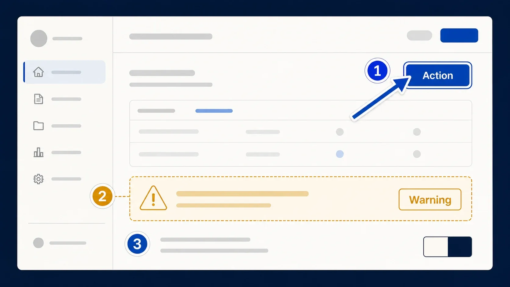
Color must never carry the meaning alone. Pair a warning color with a word such as “Do not share,” a number, an icon, or a different outline style. Google’s W3C guidance on using color explicitly warns against using color, size, or location as the primary way to communicate information. That rule also makes screenshots easier to understand in grayscale, on dim displays, and for readers with color-vision differences.
For web content intended to conform to WCAG, W3C documents a 4.5:1 minimum contrast ratio for normal text and images of text, and 3:1 for large text. Treat those ratios as a useful target for screenshot labels as well, then test the exported pixels over the actual background.
Choose Step markers or separate images
Use numbered Step markers when all controls remain visible in one stable screen and the action order is linear. Three or four markers can turn a compact toolbar task into one readable image. If a click opens a modal, changes the page, requires scrolling, or creates a branch, use a new screenshot for that state.
Snagit Step Recorder can capture clicks and organize them into an editable sequence. TechSmith’s current Step Recorder page describes the capture, review, edit, reorder, and refinement workflow. Automation produces a starting draft, not editorial approval: remove accidental actions, rewrite vague text, verify the order, and inspect every captured frame for private data. The Step Recorder guide covers that cleanup in detail.
Keep the instruction usable without the image
Readers shouldn’t lose the procedure when an image fails to load or can’t be seen. Put the action in nearby text and use the screenshot to reduce ambiguity. Don’t write “click the red box above.” Name the control, “Select Export,” then let the visual point to Export.
For alt text, describe the meaningful interface state and what the annotation identifies. A useful example is “Snagit Video capture panel with an arrow pointing to the System Audio toggle.” Do not start with empty framing such as “Image of.” Microsoft’s current alt-text guidance recommends concise text focused on the image’s purpose and a longer surrounding explanation for complex visuals. Google likewise recommends keeping explanatory information out of screenshot pixels when real text can carry it in its image guidance.
Captions and alt text should not repeat each other word for word. Alt text identifies the useful visual information; the caption can explain why the choice matters or mention a limitation.
Treat privacy as a separate QA pass
Annotation directs attention, and it can just as easily expose an email address, account name, URL token, avatar, customer record, or background notification. Use safe demo values at capture time. When real data can’t be avoided, use an opaque cover for sensitive text and verify a flattened export. Soft blur is useful for reducing distraction, but it shouldn’t be your only control for credentials or regulated personal data.
Check the entire frame, including areas outside the central form. Tabs, browser history suggestions, filenames, profile menus, taskbar notifications, and reflected content in other windows are common misses. The blur and redaction guide provides a separate privacy checklist.
Create a small annotation system for the team
A useful team kit is deliberately small: one arrow, one region outline, one short callout, one numbered marker, one warning treatment, and one privacy cover. Fix the stroke weight, font, padding, and palette. Save those choices as Quick Styles inside a theme so writers do not invent a new visual language for every article.
TechSmith describes Quick Styles and themes as reusable ways to keep annotations aligned with a project or brand. Save an editable SNAGX master alongside the exported PNG so a label, arrow, or UI state can be updated without rebuilding the whole image. If the screenshot belongs to a longer procedure, a reusable Snagit template can keep spacing and sequence layout consistent.
Version the asset with the article or product release. Record the app version, operating system, capture date, and source task in the filename or asset metadata. Those details let an editor identify, verify, and update the correct asset later.
Run the three-second and delivery-size tests
- Export a delivery copy and view it at the exact width used on the page, ticket, slide, or email.
- Look away, return for three seconds, and identify the first target and intended action.
- Confirm that every arrowhead lands precisely and every outline leaves labels readable.
- Read the procedure without the image and confirm that no instruction depends only on color or position.
- Scan the whole frame for private data, including tabs, URLs, notifications, and filenames.
- Reopen the exported file in a second viewer and verify sharp text, correct crop, and expected transparency.
If the target is unclear, remove marks before adding more. If the image becomes fuzzy after upload, check it at actual size; TechSmith’s image-quality troubleshooting specifically recommends viewing the source at 100% when diagnosing blur. Use the Snagit export settings guide for format, size, and compression choices.
Screenshot annotation FAQ
How do I annotate a screenshot in Snagit?
Open the capture in Snagit Editor, crop to the useful area, remove private data, and choose one primary tool. Use Arrow for a precise control, Shape for a region, Callout for a short explanation, or Step for order. Review the result at delivery size, keep the editable SNAGX source, and export a recipient copy.
Should I use arrows or boxes?
Use an arrow for a precise control and a box for an entire field, panel, or region.
How many annotations should one screenshot have?
Use as few as the task needs. If unrelated targets compete, split the image or use a short numbered sequence.
What file format should I export?
PNG is a dependable default for sharp interface screenshots. Keep an editable SNAGX source separately when you may need to revise the objects.
How should I write alt text for an annotated screenshot?
Name the meaningful interface state and the control or result identified by the annotation. Do not begin with empty framing such as image of.
Can I annotate a screenshot without Snagit?
Yes. Windows Snipping Tool and macOS Preview handle quick markup. Snagit is more useful when annotations must remain editable, styles must stay consistent, or the image belongs to a maintained documentation workflow.
When should I use Snagit Simplify instead of more annotations?
Use Simplify when irrelevant interface detail competes with the task. Keep the literal screenshot when exact text, state, or evidence matters, and do not treat simplification as secure redaction.
Can Windows Snipping Tool add arrows, shapes, or text?
Microsoft currently documents Pen, Highlighter, Shapes, emojis, Crop, and Text Actions for OCR and quick redaction. Use Paint when you need typed labels or broader layout controls.